Chris Vizes Data visualisation and more
Kicking off exam preparations with a viz about millionaires
The Plan
I’m planning on taking the Tableau Certified Professional exam soon and as a part of preparing for it, I want to practice making dashboards quickly that are effective and follow visual best practice. My plan is to make one each day, spending no more than an hour on each. The time limit here is key as it is an important factor in the exam and creates pressure to have an efficient process in creation.
What I did
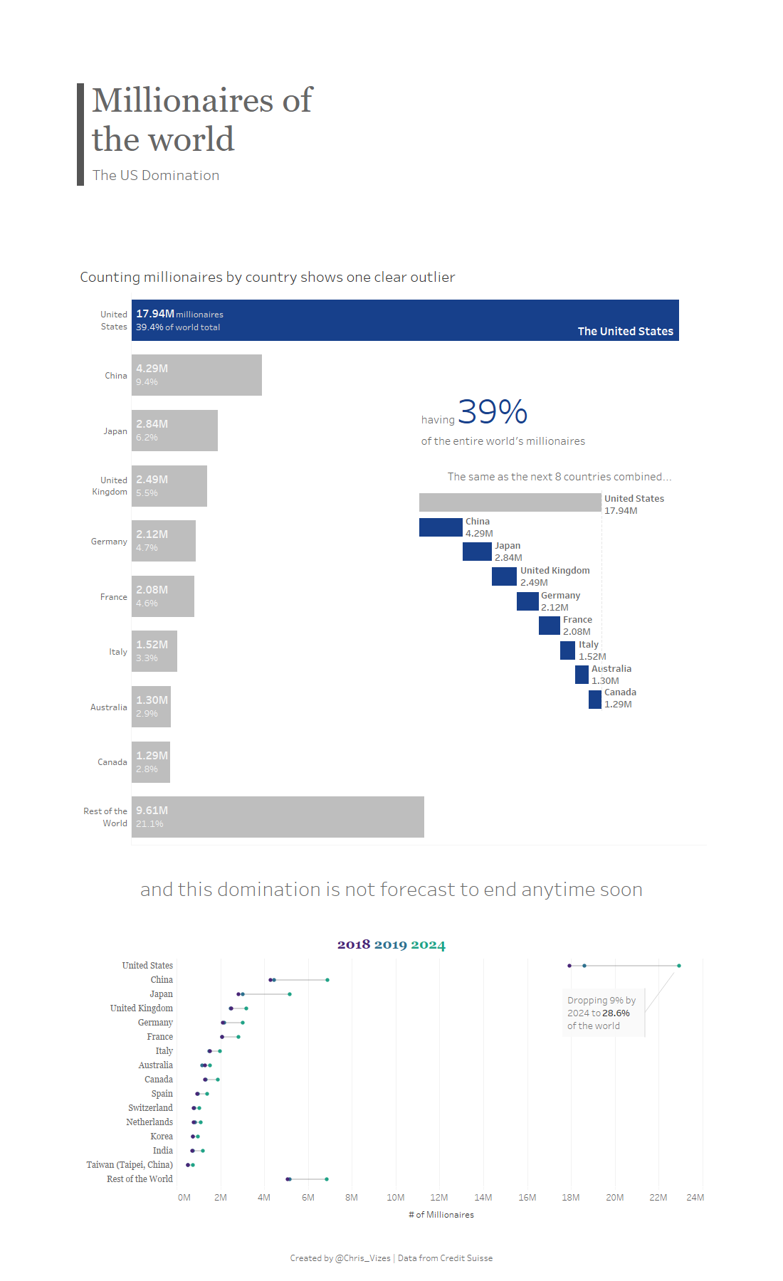
To kick off this sprint, I created a dashboard taking a look at data on the number of adults with wealth greater than $1M. Now I’m not exactly sure on the definitions here of wealth, nor how it is measured so please take my dashboard with a pinch of salt.
Reflections
To try and grow I want to record down my thoughts on the dashboard. It may also help indicate why I made certain decisions if you’re interested. Without blowing my own trumpet, let’s start on a positive note.
The Good
- I quite like my focus into one particular country as it created a better story as you move through the dashboard.
- I like the use of colour (at least in the top half) to focus on this story, highlighting particular elements.
- To compare the countries on this value and show how countries rank at the same time is the perfect case for a bar chart and I think this was the right choice.
- Breaking up the countries into the top countries and then the rest of the world was suitable here too as the numbers became less important the further down and really we are looking at US comparisons.
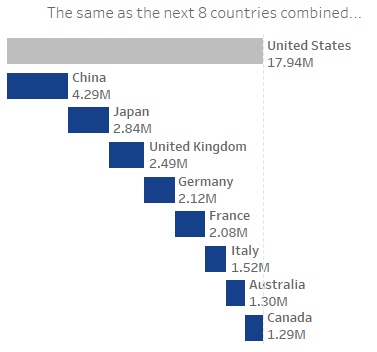
- To tell the story of how dominant the US is, I think going from the bar chart to the waterfall, showing how all the countries add up to the US, was an effective way to do this. It makes the sum of these value visually clear.

- I like the reference line on the waterfall chart making it clearer how the totals are the same. It’s pretty subtle but I think helps.
- I think using the BAN of the US percentage was a great fit for the flow of the story working through the dashboard.

- It’s a nice blue.
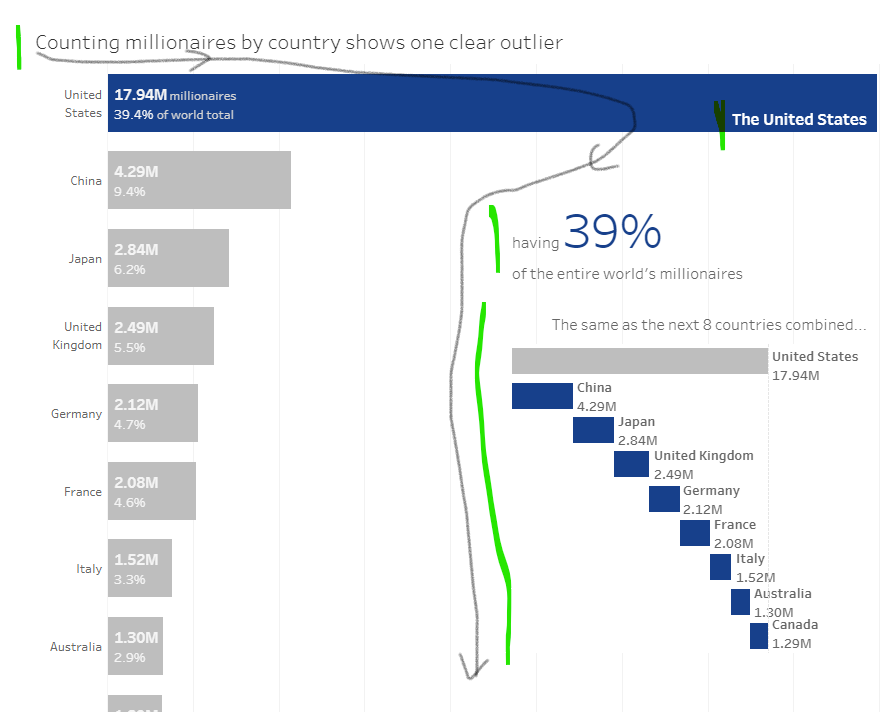
- I think I got the flow working quite well here for where the eye travels down the page in roughly the path shown below. Left to right, top to bottom, looking at the big numbers and highlighted colours first. This helps follow the narrative of the dashboard.

The Bad
- I’ve used a blue colour to highlight features of the dashboard, but by using the same colour for different highlighted elements, I’ve introduced a potential source of confusion. For example the blue at first indicates the US, but then turns into indicating the countries we are comparing to the US. These colour uses are also both visible at the same time, being in near proximity to each other, amplifying the issue. I don’t think it’s too much of an issue as the other labelling is pretty clear, but it feels against best practice and perhaps there was a better solution here.

- The bottom chart was meant to show how the US is predicted to maintain it’s large domination of the worldwide millionaire population and I think it does answer it to some extent, but I don’t think I made a good chart choice for it. I think I made the chart first, liked it, and then tried to fit it into the narrative, which is the cause of the issue. The measure to show this “dominance” is not the total # of millionaires (as on the axis), but rather what % of the world the US makes up. The US drops by this measure almost 10% but you cannot clearly see that from the chart and this information is important. A chart showing parts to whole for the three different time periods with the US, and perhaps a couple other leading countries or the rest of the world, would have worked better I think.
- The annotation “Dropping 9% by 2024 to 28.6% of the world” was poor wording, especially in the context of the chart it was on. “Dropping 9%” implies that I’m referring to the measure shown on the chart, but I’m not. This drop is comparing the US dominance of the world, which is not only affected by the # of millionaires in the US, but also the # in all the other countries. If the above issue was addressed with the chart choice then I think that would help.
- It took me more than an hour to create, coming in at roughly an hour and a half. This is not an easy issue to address other than just stopping when the time is up. Perhaps I should have scaled back the work towards the end when I could see I wasn’t going to finish. Perhaps more foresight was needed in how long the design was going to take me. Perhaps I should of found my angle more quickly. This one is a hard one and has been a big focus of my time at the Information Lab since starting 6 months ago.
- The top bar chart of the viz takes up so much room and may not even be visible in one go for some users. I don’t think there really is a need for this, perhaps I should have reduced the label detail, shrank it down and then had the waterfall by it’s side. I think there is a better layout, but I can’t quite picture it.
- I didn’t turn off or address mobile layouts.
- I’m not entirely sure if this is an issue or not, but I may have misrepresented the numbers. The source says the figures are in terms of thousands, but I have not shown them as such. I did this because I couldn’t see how the numbers would make sense if they represented thousands. It would have shown billions of US millionaires, but there aren’t billions of US citizens! More investigation needed.
- Part of this comes down to myself no knowing, but I should have included a definition of terms used. I.e. who do I define as a millionaire? When was the study? Who was the study by? How was the data collected? What is the prediction based on?
Day One Complete
That’s the first one done, and even a little blog to reflect on it. Fingers crossed I can keep pumping the dashboards out at least in preparation for the exam.
Have any feedback or ideas?
Pop me a message on twitter @Chris_Vizes
Thanks for reading.
Written on June 7th, 2020 by Chris Meardon