Chris Vizes Data visualisation and more
Marimekko Charts Simplified

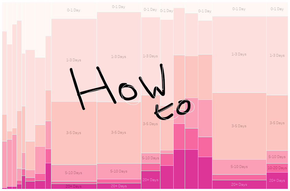
Marimekko charts can be a great way to display distributions of data and to make full use of space. I’m a fan and I like building them but there is a bit of a barrier to entry as they include advanced table calculations and LODs (in Tableau at least).
To help with this you can download the various available Marimekko charts published to Tableau public and replicate their calculations, but adapting them can be difficult. This blog is there to explain one of the key calculations behind the chart as I don’t think anyone else has laid it out simply.
The Calculation
IF FIRST()==0
    THEN min([Failures per column])
ELSEIF min(DATETRUNC('month', [Date]))
    != LOOKUP(min(DATETRUNC('month', [Date])),-1)
    THEN PREVIOUS_VALUE(0) + min([Failures per column])
ELSE
    PREVIOUS_VALUE(0)
END
Put simply, this is the calculation that determines the position of the bars horizonatally. It is the x axis. It is what’s on columns.
but with these few comments it is much easier to interpret and adapt to your needs, so if you’re looking to build a marimekko then this may help!
IF FIRST()==0
the first mark
THEN min([total measure per column])
the total of the measure for the first column of chart
ELSEIF min(field that defines column)
    != LOOKUP(min([field that defines column])),-1)
a new column of the marimekko
THEN PREVIOUS_VALUE(0) + min([total measure per column])
running total of the measure
ELSE
this is not a new column or the first mark (i.e. any part of the stacked bar chart that isn’t the first one)
PREVIOUS_VALUE(0)
keep the column width of the mark below
END
Example
Check out my dashboard on Tableau Public